Cross-Product Card
Finding the right credit card is a very taxing process. Terms are complicated, they change frequently, and there are hundreds of options to choose from. One of the most powerful tools at a user's disposal is the ability to compare these products against each other. While NerdWallet has an existing comparison page, only 4-5% of CC shoppers find and use it.
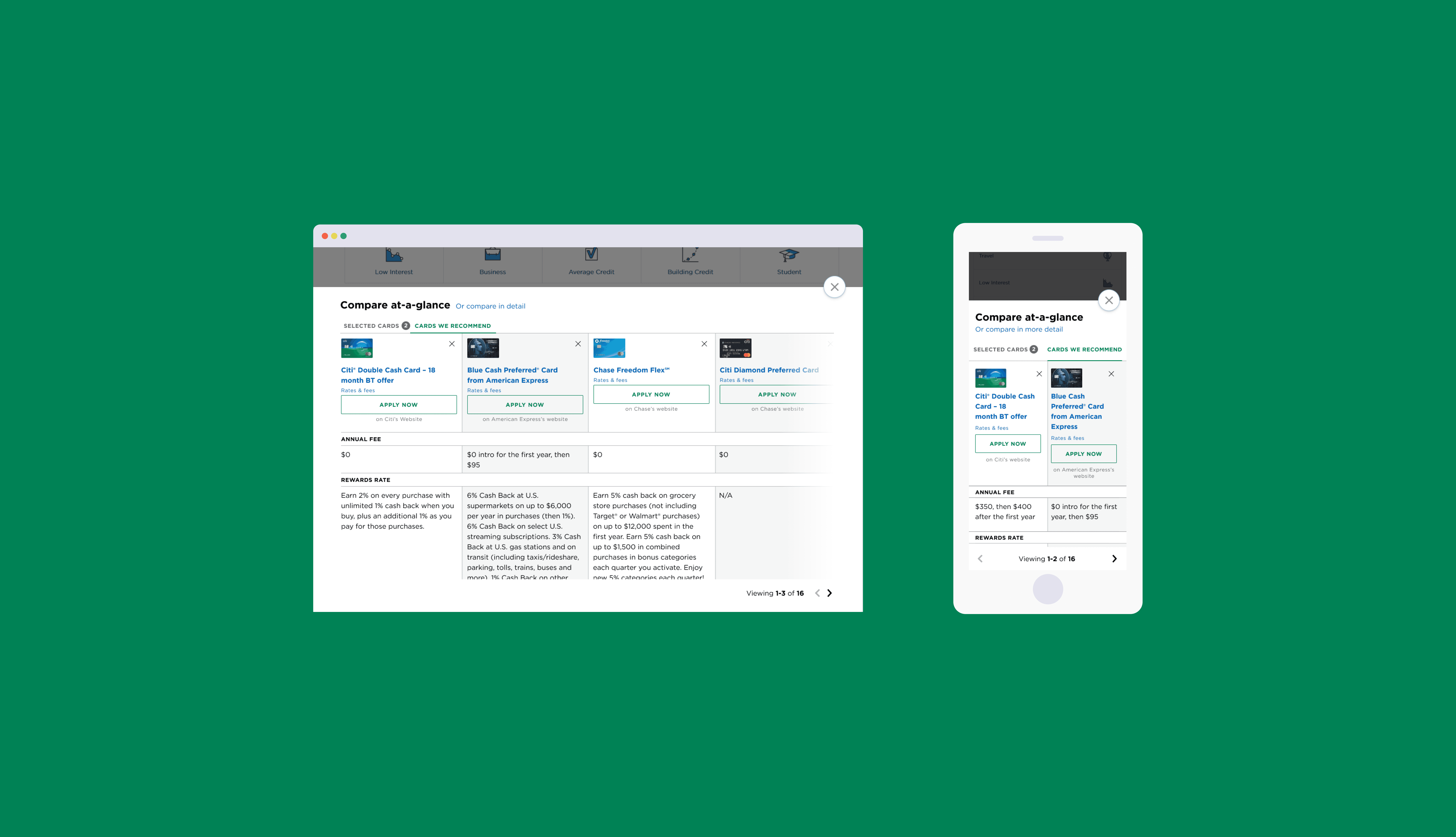
At NerdWallet, my team and I created a comparison widget that is easy to find, highly sought after by our users, and embeddable within any shopping page. From a user perspective, it provides an invaluable tool to help simplify comparison shopping and efficiently pick the right product for them. From a product perspective, this empowers parts of NerdWallet that don't have compare functionality to get it in a consistent way. We dubbed this feature the "Cross-Product Card" (CPC), since it allows for comparison shopping across multiple product verticals.
I led the design of this feature, working with my partners to ensure that our solution was simple for users and readily scalable to other products.
To kick off the project, we defined some key metrics for success, design principles, and conducted some competitive analysis.
We wanted to clearly define what success looked like. The core values this feature needed to deliver was a simple comparison experience that was easy to find, helped users narrow their choice, and was simple for other product teams to use. To measure success more concretely, we used clickthrough rate (CTR), monetizing clicks per visitor (mCPV), and net conversion (nConv). At a high-level, these metrics revealed how many users interacted with the feature, if the information provided is enough to move on to an application page for a product, and ultimately if they got approved for that product.
I got to work conducting gathering existing resources on our users, as well as some competitive analysis through two lenses: how do our users comparison shop in general, and how do users comparison shop for credit cards? With this context in mind, I moved on to sketching and concepting.
I started by sketching 5 different low-fidelity design directions, regularly checking-in with stakeholders to index against our project goals. We landed on a final solution after three rounds of iteration, user concept testing, and increasing fidelity.